Visual Evidence of an Agile Release
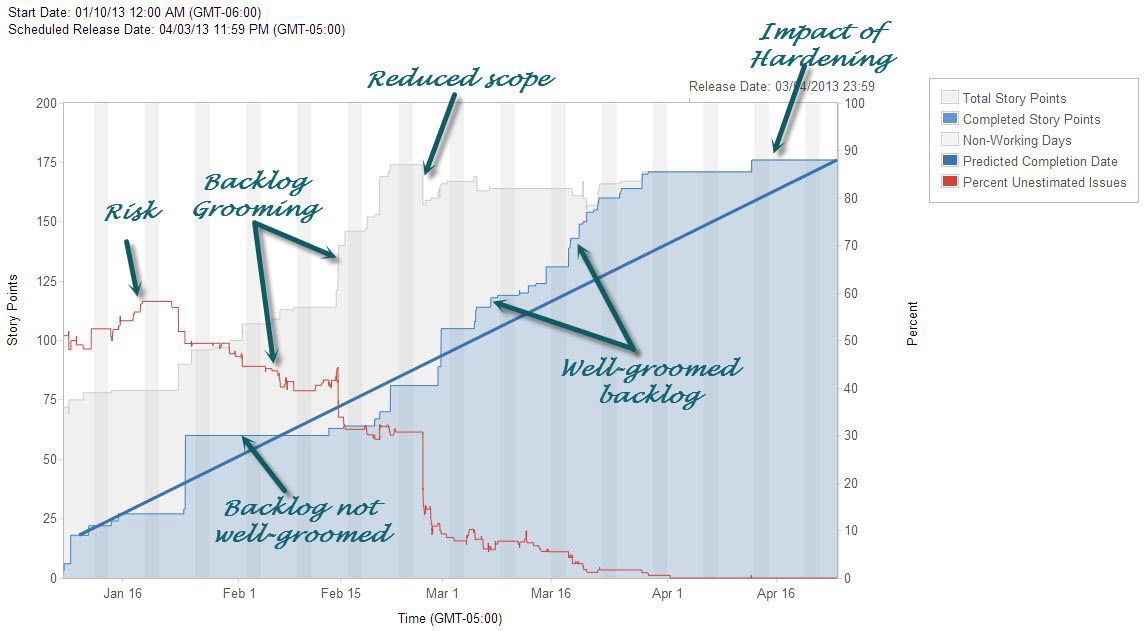
Below is a fancy release burnup chart (click it to see the full image) that visually shows the work of a team from a recent release by a LeadingAgile client.
The red line effectively is the amount of risk. You can see that the team started the release with about 50% of their stories unsized, but consistently drove that down through the first half of the release.
You can see the impact of end-of-release hardening in the flatness of the shaded blue area on the right side of the chart.
In the shaded gray area, you can see the team performing backlog grooming, breaking down the work into estimated stories and even cutting scope mid-release (the gray area increases as the red line decreases).
The flatness of the shaded blue area early in the release shows the impact of a backlog that isn’t well-groomed, but as the team drove that red line down, the blue area takes on a more-consistent positive slope.
Cool stuff that demonstrates the impact of a groomed backlog and the effectiveness of a team.
Comments (3)
Paul Hodgetts
That’s a cool chart, thanks Peter! I love how it tells a story…
The red line is labeled “amount of risk” which is described as the percentage of stories unsized. Does it include any other factors of risk? I would guess story sizing is a fairly pragmatic risk indicator, since inability to size is usually driven by other “risk” factors such as unvalidated requirements or implementation approach, etc.
It’s really interesting to me how driving the initial risk down seems to correlate to increasing the scope. Was that simply because the points were not counted yet, or did the team’s idea of scope actually increase as they explored it more? But the later drop in risk did not seem to increase the scope. Why was that — were the stories removed at that point the unsized ones?
It’s also interesting to see the “flat lined” velocity in two places in particular. First when the team I presume needed to stop and catch up on grooming. And second during what you call the “hardening” period. It makes a good case for how any kind of debt (grooming debt, done-ness debt) impacts continuous flow.
Thanks again!
Paul
Great questions, Paul.
The red line indicates the percentage of stories that haven’t been estimated. For purposes of labeling the diagram, I called that risk for the reasons you identified.
Driving the initial risk down didn’t increase scope per se. The stories were already identified, they just hadn’t been sized. The shaded gray area represents the total number of story points. As the stories are sized, the percentage of unsized stories (red line) goes down while the number of story points increases. The dramatic drop in unsized stories (i.e. risk) that coincided with a slightly less dramatic drop in total story points was probably the result of a grooming session that resulted in some previously-sized stories being removed and many other unsized stories being sized or eliminated from the backlog.
The flat velocity early and late in the release definitely shows an interruption in flow. One other thing it represents is part of the transaction cost of a release. The transaction cost of a release is what it takes to begin and end a release, including things like regression testing, packaging, and deployment in addition to backlog preparation. Comparing transaction cost and holding cost (the value of backlog items that are completed but not deployed) is a key to determining the ideal duration of a release.
Thanks for the questions and feedback.